Wellframe Staff Workflows
Turning care-manager workarounds into product workflows.
I led two focused improvements to Wellframe's staff dashboard: a chat template messaging system that replaced copy-and-paste workarounds, and a new library layout that made educational care programs easier to discover.
Across both projects, care managers had already invented ways to compensate for gaps in the product—Word documents, printed lists, and handwritten cheat sheets.
As the sole designer, I owned research and design end-to-end, working with Product, Engineering, clinical and customer-facing partners to bake those workflows into our product's ux.
Project 01 - Chat Templates
Care managers needed custom chat templates
Wellframe care managers use secure chat for onboarding, education, and ongoing care for their patients. The original templates ux offered roughly ten fixed messages, and staff had no ability to edit or write their own.
Highly requested
Our dashboard already had a chat templates feature, but it was a limited set of 10 pre-written messages that staff could not edit or adapt to their own context. But sending repeat messages was an extremely common workflow across members and across diagnoses, so adding more template messages consistently ranked among staff users' most requested improvements. In two surveys, it was ranked #2 and #5 on most requested, and it frequently came up in my discovery calls.
Staff already had workarounds
Care managers often showed me Word documents they had with dozens of frequently-used messages they had written themselves. Instead of using Wellframe's limited template feature, they copy/pasted from those Word docs.
A Legal decision to handicap
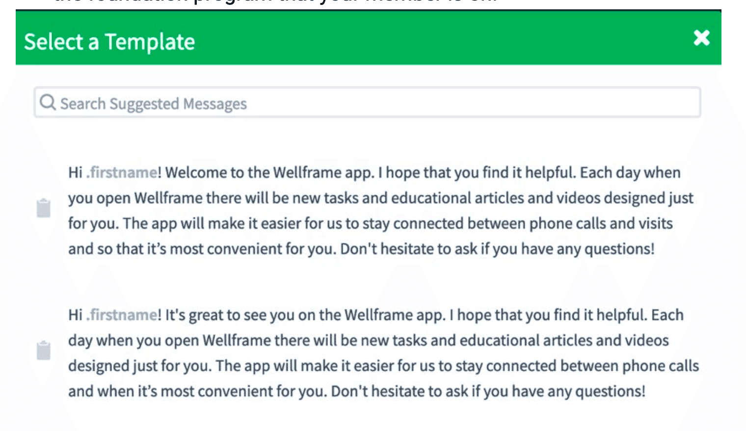
Care managers could also text members who had not yet completed onboarding -- a feature that staff found incredibly useful. But because SMS is not a secure channel, Wellframe's legal team identified a risk that staff could accidentally send sensitive information the wrong patient. They made the decision to downgrade the feature and remove the ability to compose SMS freely when sending a message. Instead, staff would only be allowed to send templated messages that had been pre-written for them ahead of time, making accidental disclosure less likely.
Highly requested
Our dashboard already had a chat templates feature, but it was a limited set of 10 pre-written messages that staff could not edit or adapt to their own context. But sending repeat messages was an extremely common workflow across members and across diagnoses, so adding more template messages consistently ranked among staff users' most requested improvements. In two surveys, it was ranked #2 and #5 on most requested, and it frequently came up in my discovery calls.
A new, full-featured chat template system
I argued for solving both problems at once
Instead of just removing the SMS feature which I knew would hugely impact staff satisfaction given its usefulness, I advocated for building a full featured template system. This would both address the long-standing demand for better chat templates and also solve the SMS compliance issue, so we could deliver something that actually improved staff satisfaction.
Lightweight, without leaving the chat workflow
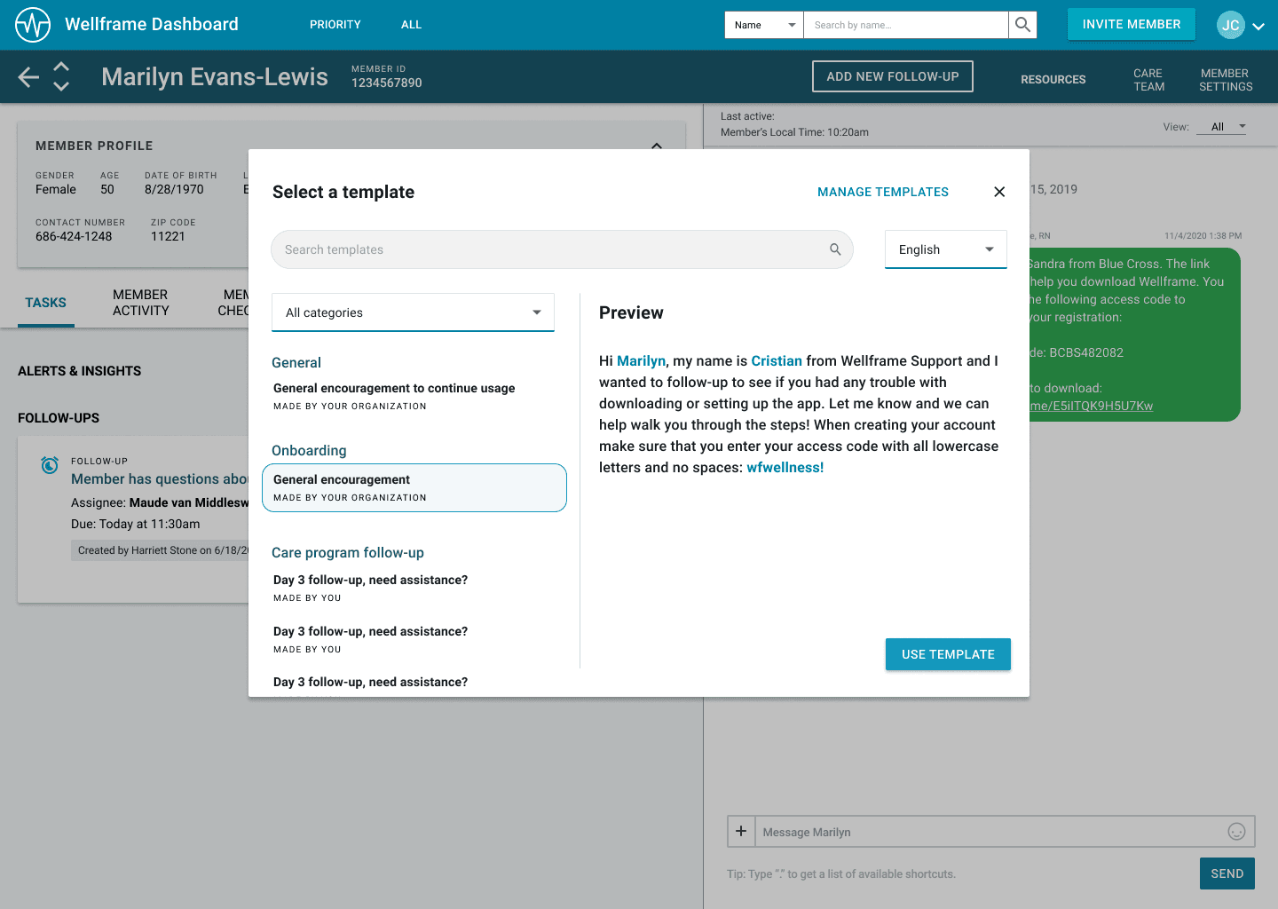
The shipped design enabled care managers to create templates that reflected their workflows, and reuse the same ux pattern across both chat and SMS. I focused on the capabilities care managers needed most: creating and naming personal templates, search, simple categories, language selection, and organization-authored defaults. I also mocked up other functionality that was cut for engineering scope, like favoriting, and other features like sharing templates with coworkers was requested but I knew would also add too much scope and did not explore it.
One reusable system
One small challenge that came up during discovery calls was that staff often need to schedule calls with their members during the SMS onboarding phase, e.g. "I'll call you on this date and time to help with registration." A fixed template made that difficult, so the solution I found was a date/time placeholder added while creating a template, then when later sending that template, it would give date and time pickers for the user to finish populating the message.
I argued for solving both problems at once
Instead of just removing the SMS feature which I knew would hugely impact staff satisfaction given its usefulness, I advocated for building a full featured template system. This would both address the long-standing demand for better chat templates and also solve the SMS compliance issue, so we could deliver something that actually improved staff satisfaction.
Metrics & Impact
After launch, template use grew and stayed high
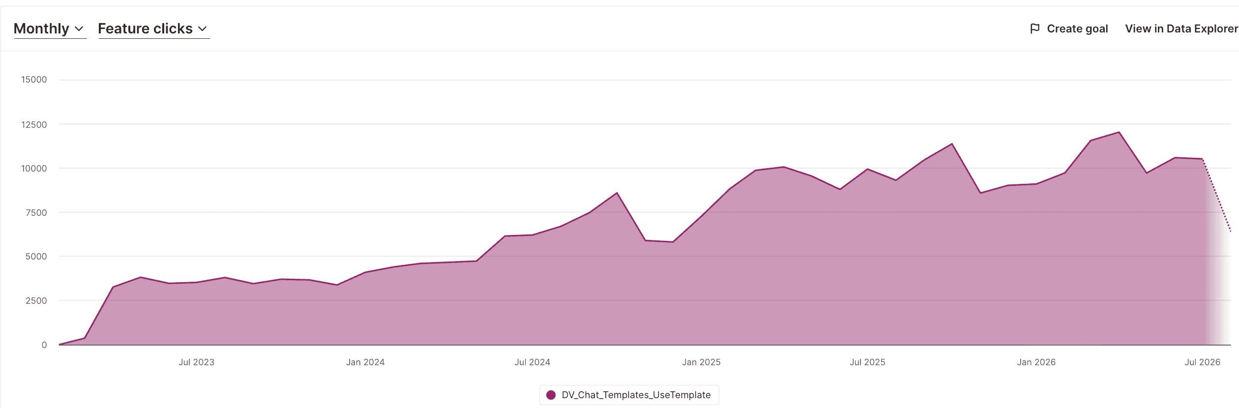
From launch through August 2026, care managers loaded templates nearly 700,000 times: 290,000 chat templates loads and 404,000 SMS templates. Monthly usage has grown over time from ~3-4K per month and stayed high years later to ~9-12K recently.
SMS templates were also highly adopted
SMS templates have even greater volume of usage than chat templates, showing we successfully preserved that workflow despite the compliance guardrail.
Qualitative feedback has been overwhelmingly positive
Even years later, unprompted in my discovery calls, the feature receives strong praise from care managers for saving them time. Staff also request the same pattern be extended to other parts of the dashboard, another strong signal.
After launch, template use grew and stayed high
From launch through August 2026, care managers loaded templates nearly 700,000 times: 290,000 chat templates loads and 404,000 SMS templates. Monthly usage has grown over time from ~3-4K per month and stayed high years later to ~9-12K recently.
PROJECT 02 - EDUCATIONAL CARE PROGRAMS
Redesigning a resource library to enable discovery
Wellframe's educational care programs are essentially bundles of articles targeted to specific conditions and diagnoses to help educate members over time. They are one of the product's core sources of value: relevant education gives members a reason to engage with the app, which is central to the service Wellframe provides to our health plan customers.
As sole designer, I owned discovery, information architecture, prototyping, testing, and final UI end-to-end.
Before
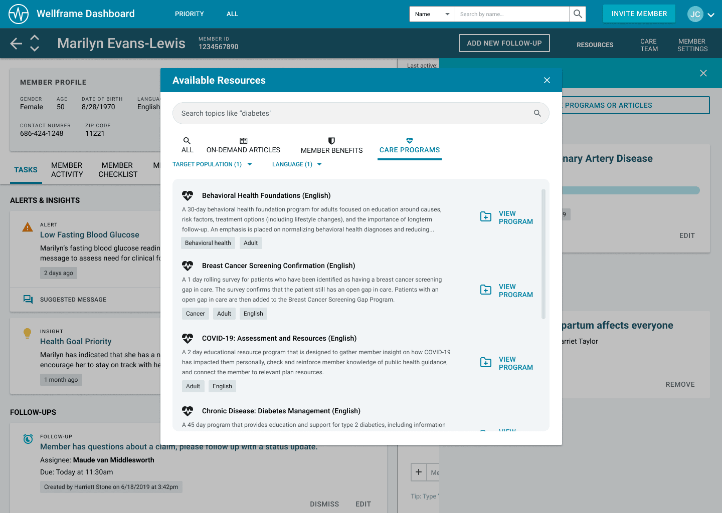
One long alphabetical list
The previous library had essentially no structure and was simply a long list of a few hundred programs. Care managers repeatedly told me that it was difficult to navigate -- the search was ineffective so it was difficult to find a program you already knew about and the list itself made it difficult to browse for something new. This was critical because if staff weren't able to find and assign a program that was relevant to a member, our research showed those members without programs were significantly more likely to churn and not engage.
Care managers already had the right taxonomy
During discovery, I investigated how care managers naturally divided the library. I found that a large number of them had printed lists beside their computers with programs they used frequently, organized by diagnosis and condition.
Explored but not shipped
So I mirrored the same mental model that staff already had, and in collaboration with our Content and mobile team, we organized the library into categories. This design I explored (left) was great for making the structure visible but during testing, feedback was that it added extra navigation (to exit the category). Something our sales team had often stressed was customers wanting fewer clicks in the product, for efficiency.
Before
One long alphabetical list
The previous library had essentially no structure and was simply a long list of a few hundred programs. Care managers repeatedly told me that it was difficult to navigate -- the search was ineffective so it was difficult to find a program you already knew about and the list itself made it difficult to browse for something new. This was critical because if staff weren't able to find and assign a program that was relevant to a member, our research showed those members without programs were significantly more likely to churn and not engage.
Final shipped design
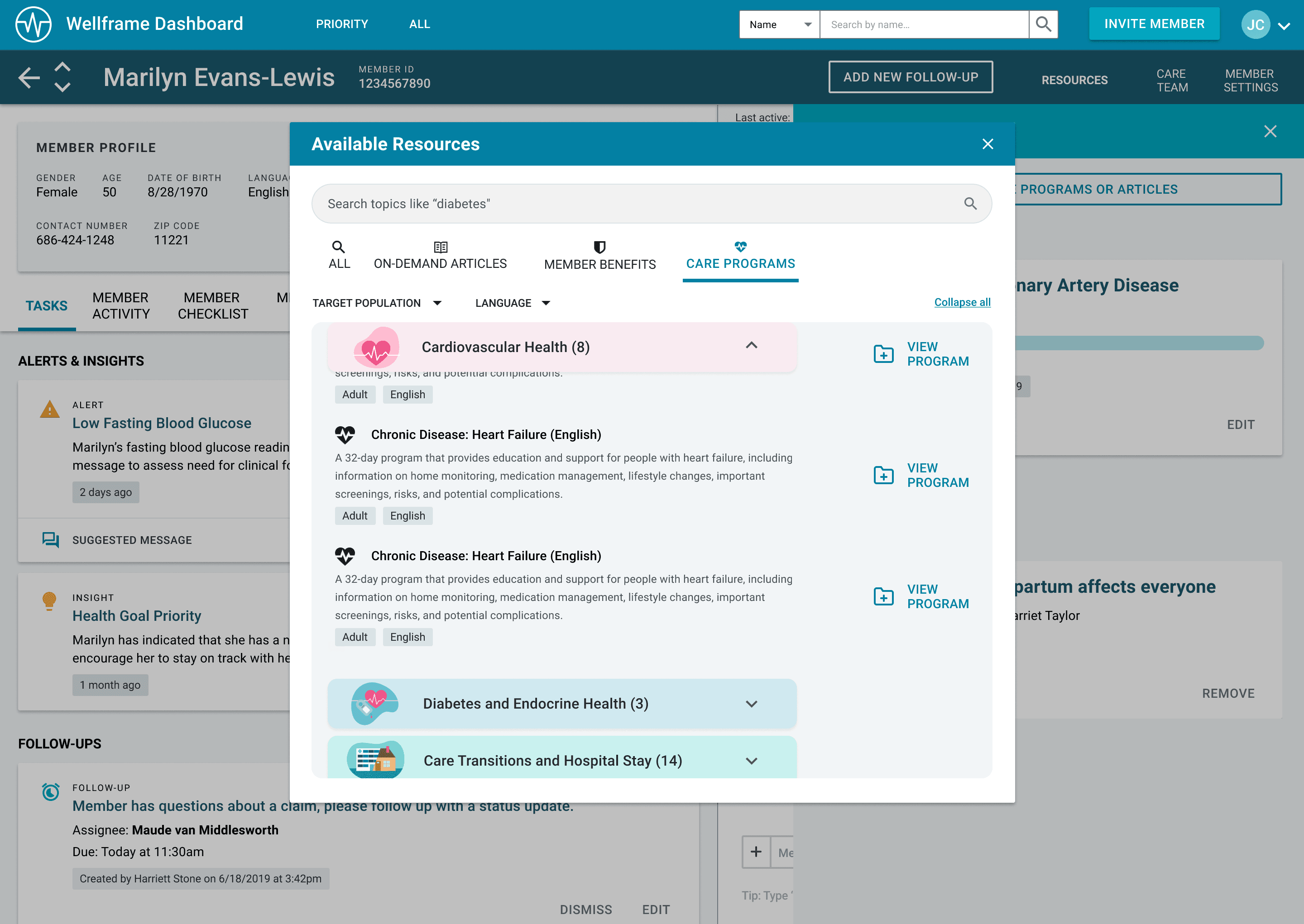
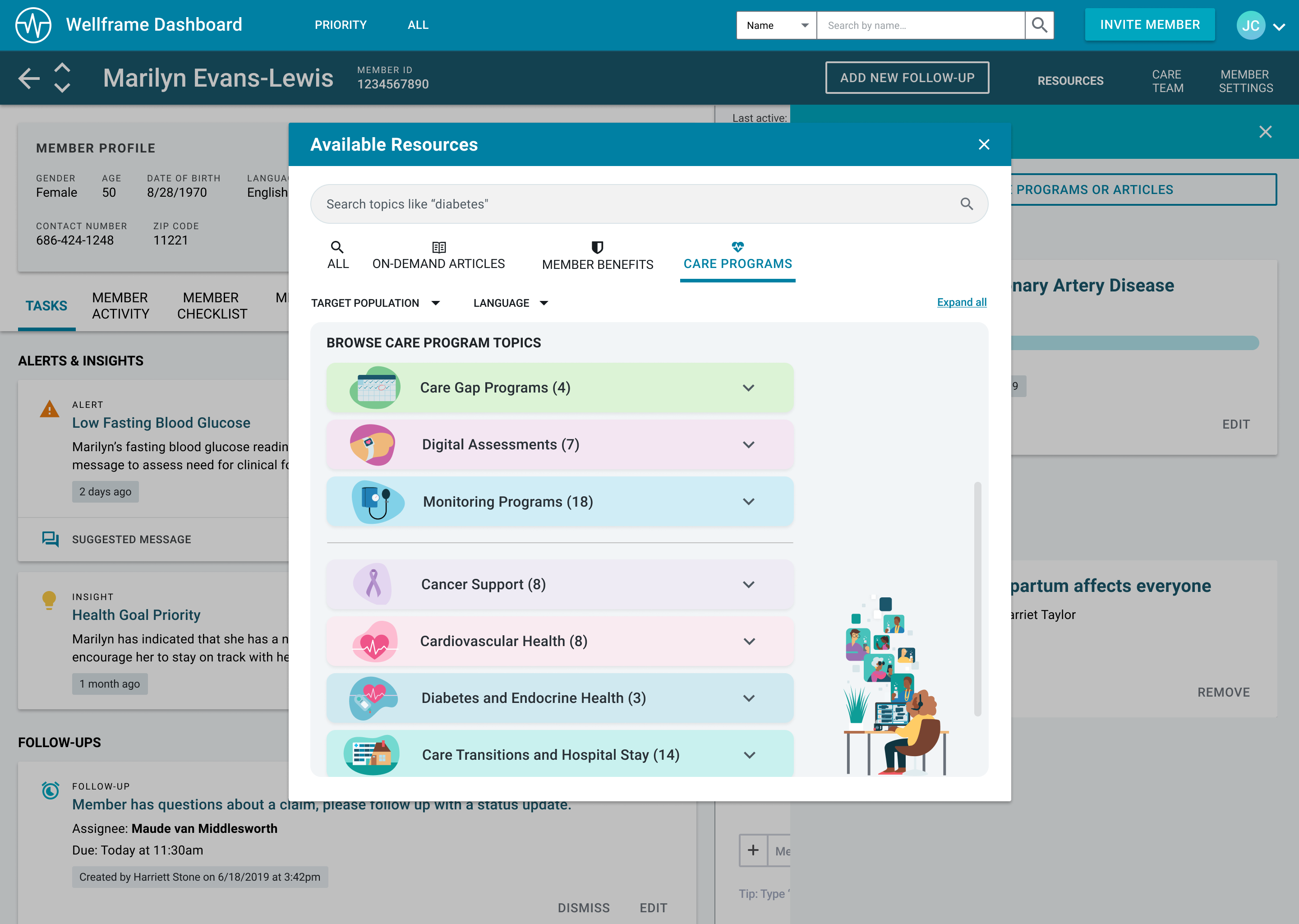
Browse multiple categories at once
This final design used expandable, sticky category headers so care managers could scan and compare efficiently. Most programs were grouped by diagnosis, e.g. cardiovascular health, but staff had also told me they often didn't know about our biometric programs, that applied across multiple conditions, so those received a category as well.
Finally some color
The dashboard previously had a very gray, utilitarian visual style so I took this as a great opportunity to introduce some more engaging visuals. I partnered with our mobile team on the illustration direction and a contractor produced some great custom illustrations, all making the library much easier to scan.
Browse multiple categories at once
This final design used expandable, sticky category headers so care managers could scan and compare efficiently. Most programs were grouped by diagnosis, e.g. cardiovascular health, but staff had also told me they often didn't know about our biometric programs, that applied across multiple conditions, so those received a category as well.
Qualitative impact
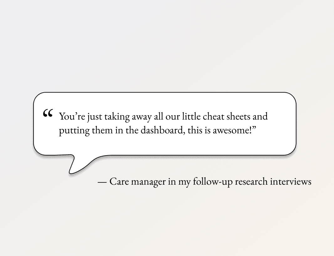
This quote from staff was a great indicator of successfully implementing the mental model they already have and making the product more efficient for them.
Categories were the highest-leverage improvement we could ship
Unfortunately other great improvements were cut for scope. I also explored things like better search, favoriting, assignment status and progress indicators but there wasn't room. Search in particular was a huge pain point that had no real workaround. But categories were the most consequential opportunity. Improvements like favoriting might make the ux slightly more efficient but categories allowed staff to discover new programs and make an assignment to a member who otherwise who not receive one, thus leading to improved retention.
Qualitative impact
This quote from staff was a great indicator of successfully implementing the mental model they already have and making the product more efficient for them.