Outcomes4Me
Redesigning the foundation of a breast cancer app
Outcomes4Me helps breast cancer patients understand their diagnosis, treatments, clinical trial options, and day-to-day symptoms. As the company's first employee and sole product designer, I owned the patient experience from user research through design, prototyping, and QA.
After the first version of the app launched, my research had shown us that patients valued the information but didn't yet have a clear reason to return to the app regularly.
I redesigned three connected parts of the experience — the onboarding flow, the homepage, and symptom management — to make the product's value clearer at first use and more useful over time.
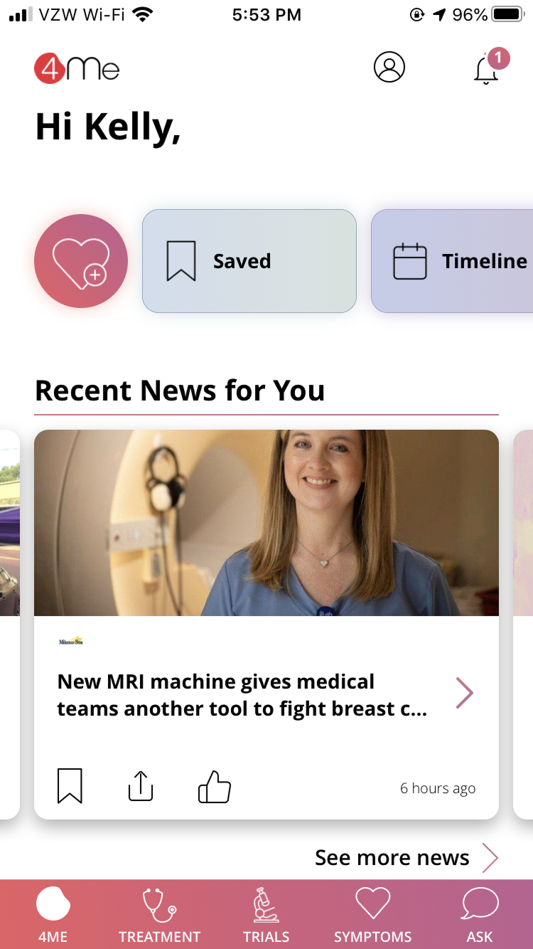
The app's value was fragmented
The onboarding flow was ineffective — patients reached registration without understanding the app's specific features or why they should trust it with sensitive health information.
Additionally, the app structure was static and didn't feel personalized, especially the homepage which was essentially a static directory. The app also didn't have features to support retention and give users a reason to return.
Impact
Monthly active users
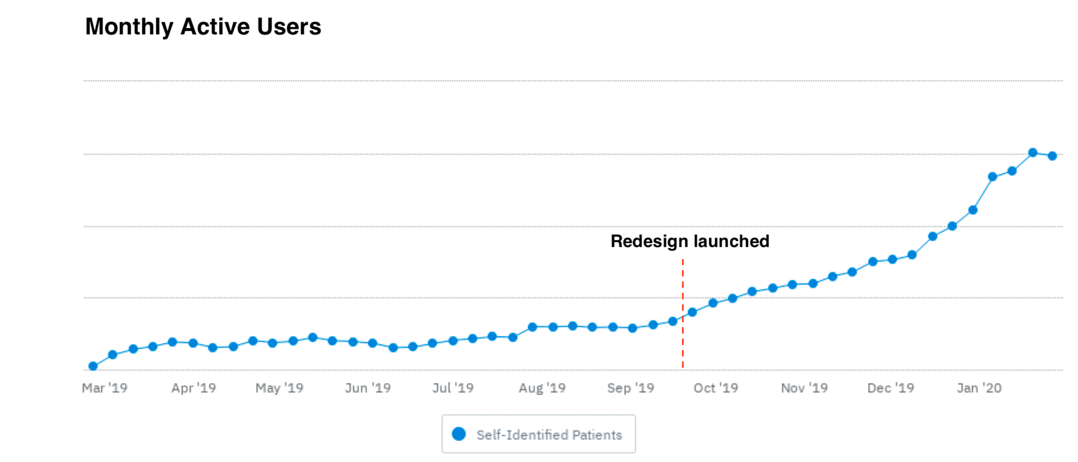
After the redesign launched, monthly active use climbed more quickly, suggesting that the redesign was at least one of the contributing factors.
New user growth
Unique new patients also accelerated after launch, with the redesigned onboarding here playing a role by giving incoming patients a clearer understanding of value before registration.
Monthly active users
After the redesign launched, monthly active use climbed more quickly, suggesting that the redesign was at least one of the contributing factors.
Make the value clear, personal, and repeatable
Goals:
1. Clear value — Help patients understand what the app can do before asking them to register
2. Personalized — Surface content and tools relevant to each patient's diagnosis and treatment status
3. Repeatable — Give patients a meaningful reason to return beyond occasional treatment research
4. Increase onboarding completion, retention, and meaningful engagement by doing the above
Onboarding
Here there were 2 overall goals:
1) Increase the number of people who successfully complete account registration and begin using the app
2) Increase the number of people who authorize the release of their medical records (because this enabled the app to deliver the most personalized value)
Old vs. New
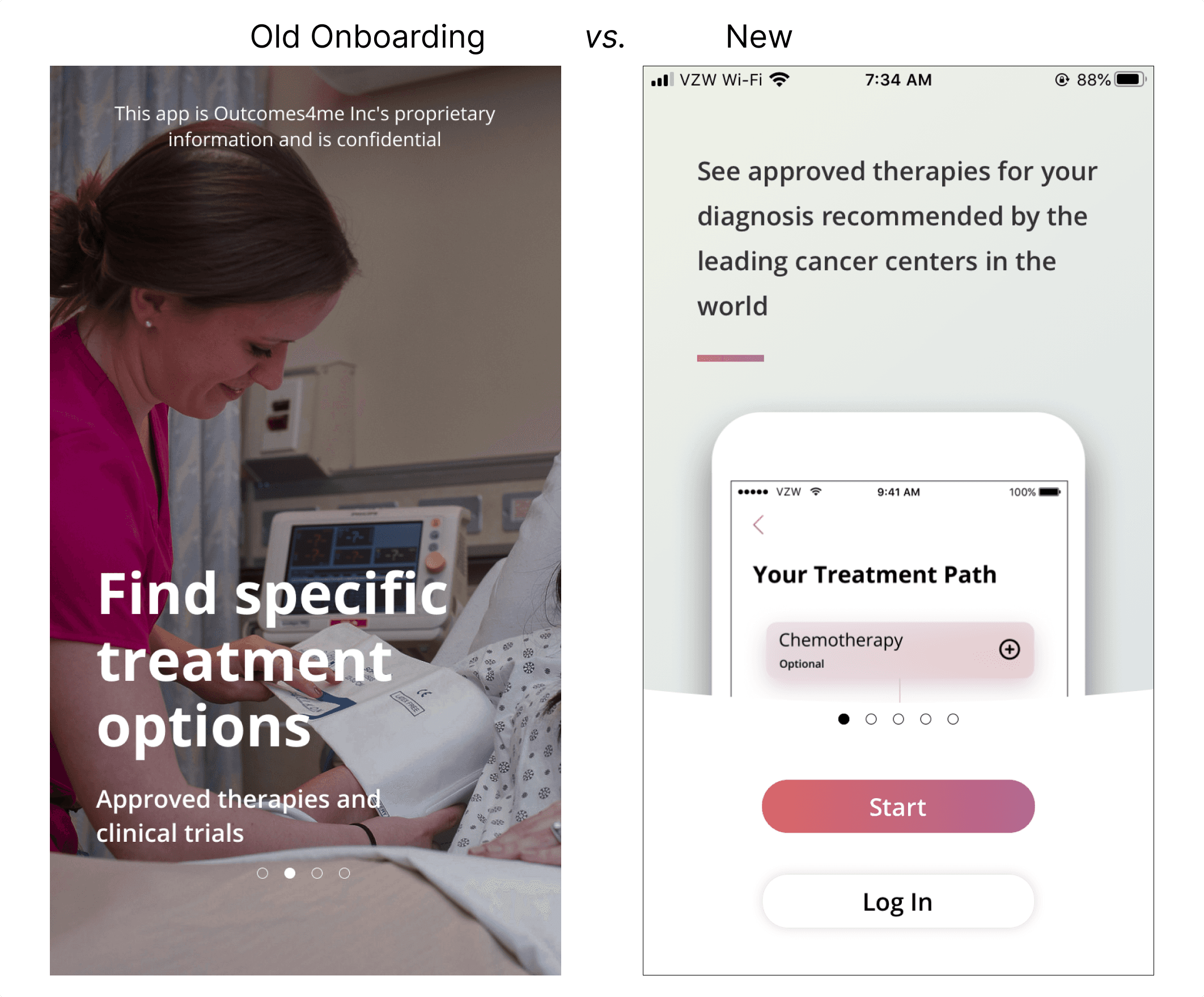
The new sequence made the product concrete using screenshots, also highlighted privacy and security, and used treatment status to personalize the app from the start.
Screenshots illustrate best
Instead of abstract promises with photographs, my redesign used screenshots of treatment guidance and other concrete features that patients told us were the most important. This helped patients understand what they would receive before starting registration.
Treat privacy like a feature, not fine print
In my research, patients specifically asked how sensitive medical data would be used and protected. I made that reassurance visible earlier and more directly instead of relying on legal language at the point of registration.
Demonstrate personalization
Patients told me they were skeptical about whether our app could deliver on its promise of a personalized cancer management experience. Specifically, they wanted the app to ask them what stage they were at.
Old vs. New
The new sequence made the product concrete using screenshots, also highlighted privacy and security, and used treatment status to personalize the app from the start.
Homepage redesign
There were a few goals here:
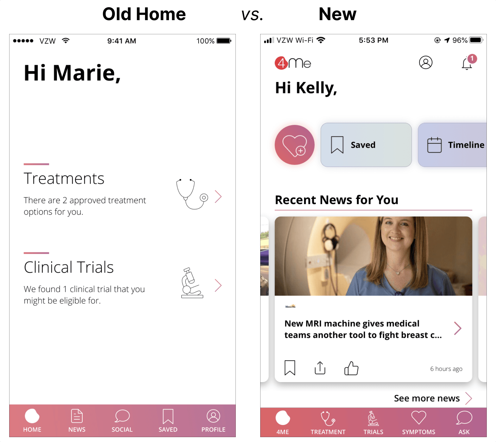
1) Surface new content relevant to a patient's individual diagnosis
2) Increase user retention and engagement by giving a meaningful reason to return to the app
3) Restructure the app around features that patients used most often
Everyday patient tasks
In interviews, I asked patients what they did repeatedly while navigating diagnosis and treatment. Three themes emerged: • logging and managing symptoms • saving information for later • finding updates relevant to their diagnosis
Dynamic content was a helpful start
One of the obvious ways to provide fresh value for daily use was to give users dynamic content. In this case, clinical trials and recent news that was matched to a patient's individual diagnosis. A big constraint though, was that as an early startup, we didn't have resources to buy and engineer content sources. But a coworker and I strongly believed in the value here, so we did the sourcing by hand: finding articles and images and formatting them so the engineering team could upload daily. This was a quick and dirty MVP way to prove our hypothesis without over-engineering first.
Restructured around patient needs
Based on patient interviews and usage analytics, our CEO suggested rearranging the app's bottom tab bar with Treatments, Clinical Trials, and Symptoms. I also added a new menu bar of shortcuts at the top so users could easily find the other features they had told us were valuable but hard to find. Most importantly, I added a shortcut to quickly log symptoms, which patients had told me was a frequent need but also helped our business strategy of aggregating patient data for clinical research. Lastly, all of this uses a flexible, modular structure, which I thought was critical for future-proofing the design.
Lightweight, daily check-ins
Lastly, I added one more feature for engagement based on a patient saying: "the nice thing about keeping a log or journal is that you can look back and see that maybe the past month was better than you thought." That gave me the idea for daily check-ins, a simple "How do you feel today" that over time would be helpful for patients to see trends. Another quote helps illustrate patient feedback on the feature: "even though it's just an app, it's still nice to be asked because I can only tell my family so many times that I don't feel well."
Everyday patient tasks
In interviews, I asked patients what they did repeatedly while navigating diagnosis and treatment. Three themes emerged: • logging and managing symptoms • saving information for later • finding updates relevant to their diagnosis
Symptom management
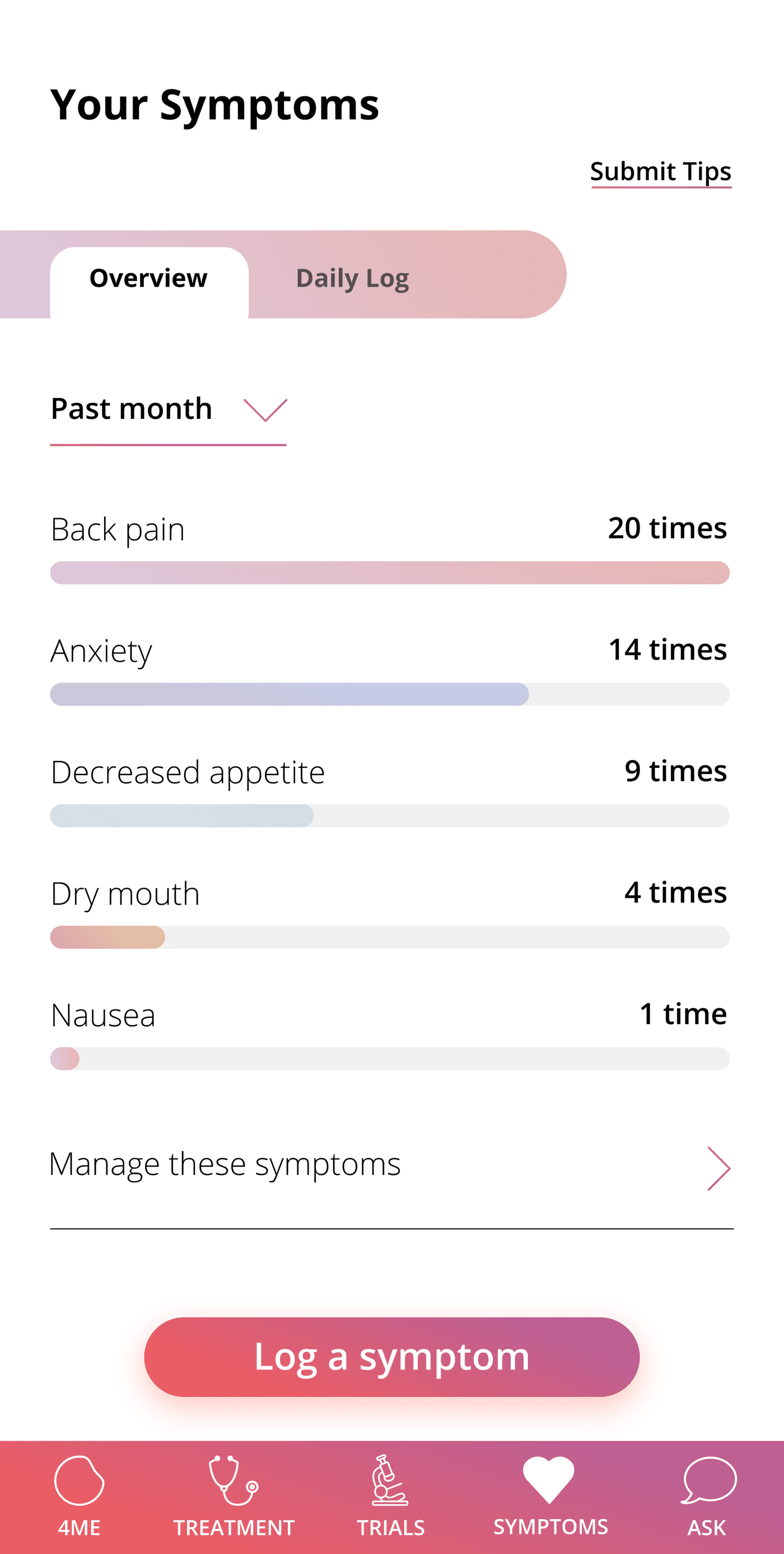
Managing symptoms and side effects is a daily struggle and one of the most common recurring activities for breast cancer patients.
As part of this redesign, we also added a completely new feature for symptom tracking and management.
Communicate with the care team
Something that emerged from talking to nurses was that patients keeping a log of symptoms actually helps improve communication when patients visit. They outlined 3 jobs: • Make logging fast enough to repeat consistently • Give management guidance for each symptom • Show trends without requiring interpretation of a complex chart
Convenient and evidence-backed
In talking to patients, I found that many actually didn't have a system for tracking their symptoms at all. I also found that a lot of patients got management advice not just from their care team, but also from forums and facebook groups. They liked that our app offered a convenient but still evidence-backed option.
Communicate with the care team
Something that emerged from talking to nurses was that patients keeping a log of symptoms actually helps improve communication when patients visit. They outlined 3 jobs: • Make logging fast enough to repeat consistently • Give management guidance for each symptom • Show trends without requiring interpretation of a complex chart