Wellframe
Designing a high-level view of a care manager's caseload
Wellframe helps health plans and nurses engage their members with educational programs, biometric alerts, and secure chat.
Care managers could act on individual tasks but they lacked a single place to understand the health of their assigned caseload. I led the discovery, product strategy, research, and design for a new Overview Page built from the ground up.
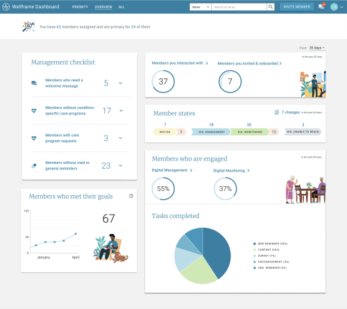
The result was one of the largest additions to the Wellframe Dashboard: a shared view of member activity, caseload trends, and care management workflows.
Impact summary
• In the first several months, 66% of users returned within 30 days (monthly cohort average)
• 24% of page views led to a member profile (where they can take action)
• 15-20% weekly adoption among active dashboard users
• Created a shared foundation for caseload management workflows
"I love Wellframe but I don't always know what to do next to keep my members engaged"
—Care manager during discovery interviews
Problem & context
How do I keep track of my key workflows and metrics?
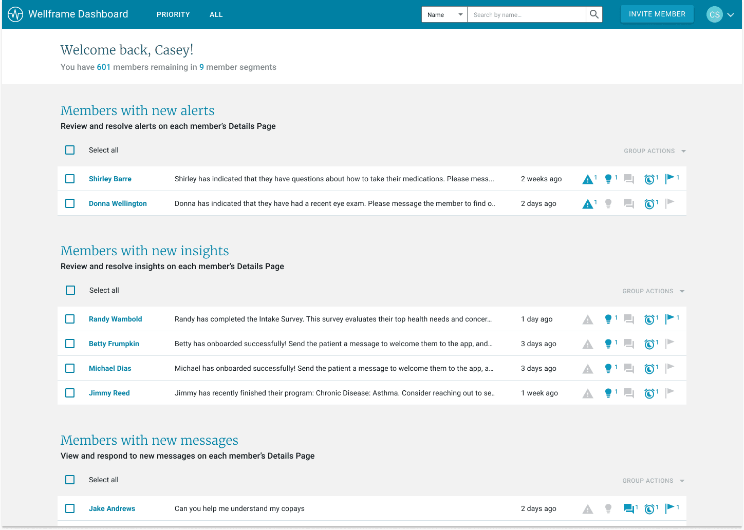
The existing dashboard was organized around individual members and tasks, so it was hard for care managers to keep track of their workflows and also get a sense of how their caseload was doing overall. 1. Best practices lived outside the product — Our Adoption Team had developed recommended workflows, but these weren't reinforced within the dashboard's ux itself 2. Care managers lacked a clear next step — During discovery interviews, staff often told me they loved our product but weren't clear on what specific actions to take to keep members engaged.
How do I keep track of my key workflows and metrics?
The existing dashboard was organized around individual members and tasks, so it was hard for care managers to keep track of their workflows and also get a sense of how their caseload was doing overall. 1. Best practices lived outside the product — Our Adoption Team had developed recommended workflows, but these weren't reinforced within the dashboard's ux itself 2. Care managers lacked a clear next step — During discovery interviews, staff often told me they loved our product but weren't clear on what specific actions to take to keep members engaged.
Process & Iteration
Continuous weekly iteration with a fully functional figma prototype
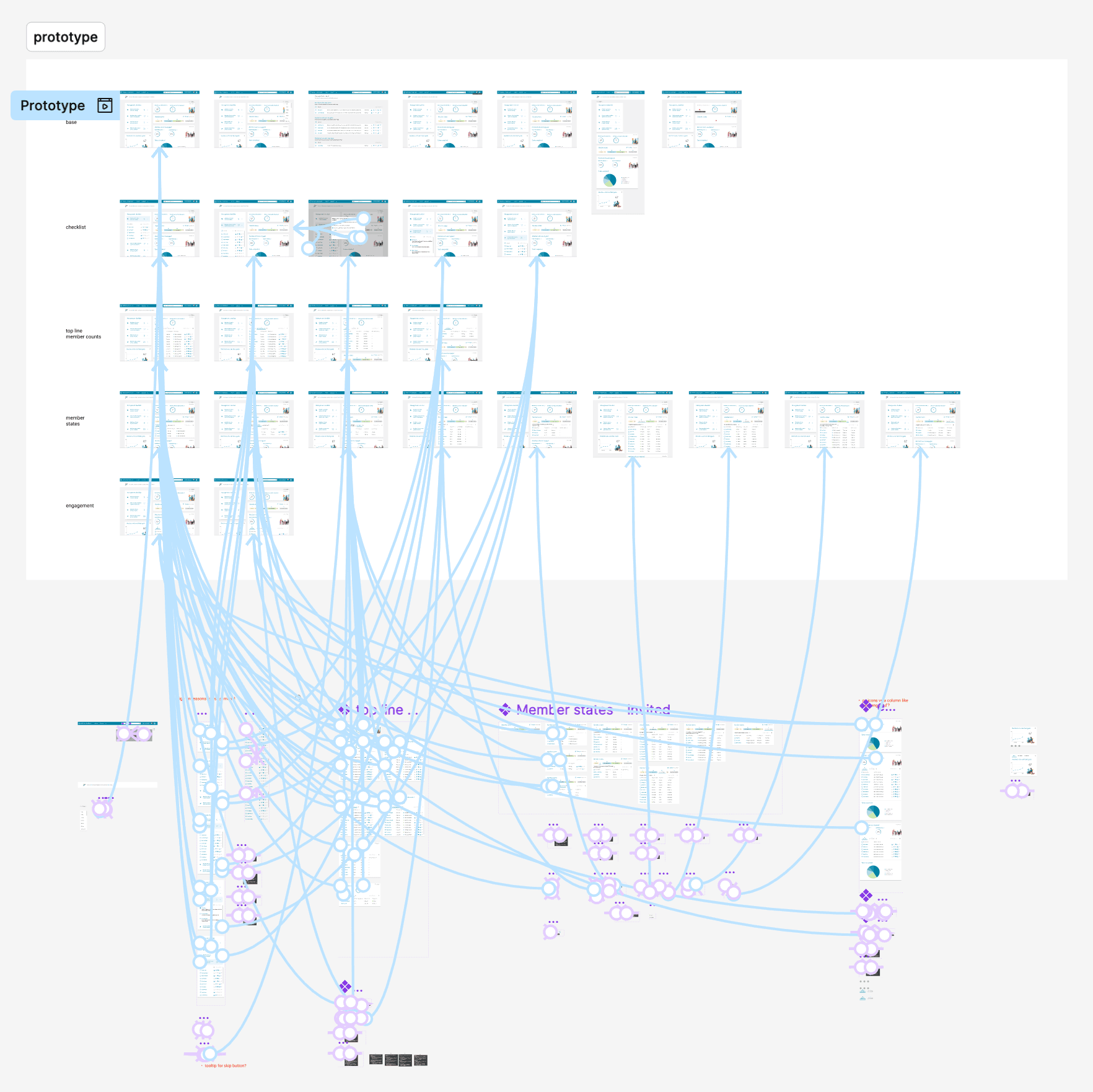
I knew alignment would be difficult because of the number of varying possible workflows so I thought a fully functional Figma prototype was necessary (of course now I'd just use Claude Code). This allowed care managers and internal partners to experience the drafted workflows and respond to something concrete. Each week, I used the prototype in either a research session with care managers or an internal workshop with Product, Data, Engineering, and our customer-facing teams, then their hands-on feedback shaped the next weekly version.
Every customer followed their own workflows and metrics
Customers all configured their teams differently and tracked different metrics. At the same time, our internal Adoption Team had a point of view with their best-practice workflows we wanted the product to support and encourage. A key design challenge in this project was creating something flexible enough to work across customers while keeping the scope focused enough for engineering to deliver.
Aligning around a common management model
Instead of trying to cram every customer workflow in equally, I aligned our Product, Clinical, Data, and Engineering teams around a common management model where we surface the highest value work first, then move easily and directly to member-level action
Continuous weekly iteration with a fully functional figma prototype
I knew alignment would be difficult because of the number of varying possible workflows so I thought a fully functional Figma prototype was necessary (of course now I'd just use Claude Code). This allowed care managers and internal partners to experience the drafted workflows and respond to something concrete. Each week, I used the prototype in either a research session with care managers or an internal workshop with Product, Data, Engineering, and our customer-facing teams, then their hands-on feedback shaped the next weekly version.
Final design
3 Constraints shaped the solution
1. Progressive detail — I knew a metrics dashboard like this could easily grow to be overwhelming so the top view needed to be simple enough to scan. Then, more detail is available when a care manager chooses to investigate. 2. Diverse workflows — I prioritized the metrics and actions with the strongest clinical value and the most overlap across customers. 3. Technical complexity — To enable large caseloads we made optimizations for performance with tradeoffs around refresh timing and reusing an existing bulk-action pattern.
Bringing best-practice workflows into the product
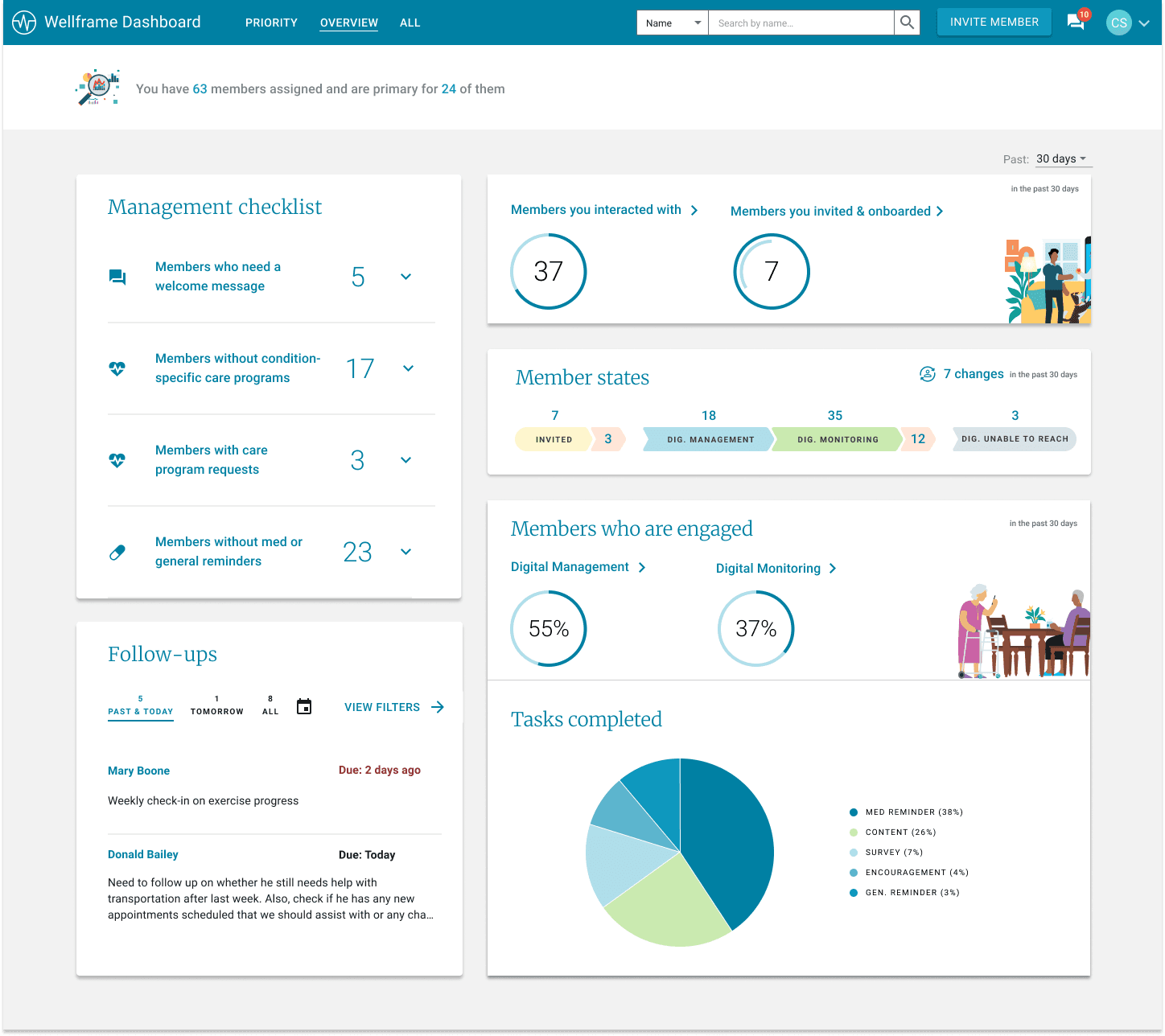
The management checklist brought recommended workflows into the product. Care managers could see where follow-up was needed, open the relevant member list, and take action without starting from a separate training document
Highlighting caseload trends and individual members
The member state view gave care managers a snapshot of where people were in their care journey and highlighted movement over time. Expanding a metric connected the caseload-level pattern back to individual members so staff can take action.
3 Constraints shaped the solution
1. Progressive detail — I knew a metrics dashboard like this could easily grow to be overwhelming so the top view needed to be simple enough to scan. Then, more detail is available when a care manager chooses to investigate. 2. Diverse workflows — I prioritized the metrics and actions with the strongest clinical value and the most overlap across customers. 3. Technical complexity — To enable large caseloads we made optimizations for performance with tradeoffs around refresh timing and reusing an existing bulk-action pattern.
Impact
Quantitative 1
A recurring starting point for action
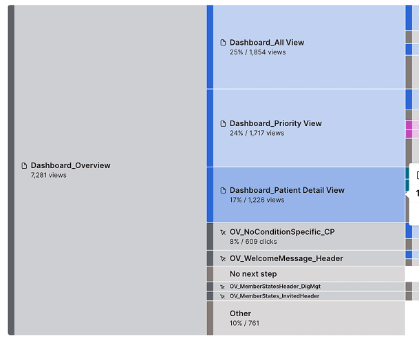
The clearest impact was giving care managers a new way to find important tasks on their caseload. Observed product behavior in the first few months: • In a Pendo analysis, on average 66% of monthly cohorts returned within 30 days. • Weekly adoption generally settled around 15–20% of active dashboard users. • 24% of Overview Page views led directly or indirectly to a member profile (where staff can take action).
Quantitative 2
Taking action
• Roughly 20% of Overview Page visits initiated a meaningful care workflow, and approximately 5% resulted in a completed action (assigning educational resources, sending a chat message, or updating care team) Unfortunately, a before-and-after comparison didn't find a distinct improvement in downstream member outcomes. For example, care program assignment within 14 days improved by two percentage points for customers both with and without Overview.
Qualitative impact
After launching, I continued my regular discovery interviews with care managers and also conducted surveys to understand where the page was helpful and what was missing. Care managers described the page as more efficient and easier to access, and a consistent, standout theme was that the page finally showed them metrics they were evaluated on but previously could not see themselves. The page also created a foundation for higher-level management workflows, including future tools we may add for managers to understand team performance. Lastly, internally, it also created alignment across our Product, Data, and Clinical teams around a shared direction.
Quantitative 1
A recurring starting point for action
The clearest impact was giving care managers a new way to find important tasks on their caseload. Observed product behavior in the first few months: • In a Pendo analysis, on average 66% of monthly cohorts returned within 30 days. • Weekly adoption generally settled around 15–20% of active dashboard users. • 24% of Overview Page views led directly or indirectly to a member profile (where staff can take action).